MidFirst MoneyMoments
Web Design & Development for a Financial Education Program
“Keeping everything organized and having a clean and easy-to-use website are of utmost importance when designing a financial education program.”
A Massive Web Design Project Becomes a Symphony of Collaboration
The bank that asked for help with this project has been one of Matcha Design’s most loyal clients. Since 2008, we’ve done a wide variety of work for them (including logos, direct mail campaigns, print design, PowerPoint, interactive presentations, screensavers, elements for ATMs, stadium animations, photography, promo videos, and interactive modules).
We were approached by the client to help with a new initiative: a financial education program. The goal? To design a website around their financial education program. The website was to be the new place for a number of reference materials that had previously been housed on the bank’s website. The new site has a different target audience from the bank, so it was critical to create a new online “home” for it.
“We worked with the team to ensure everything was improved and compliant – and they loved the end result!”
Challenge
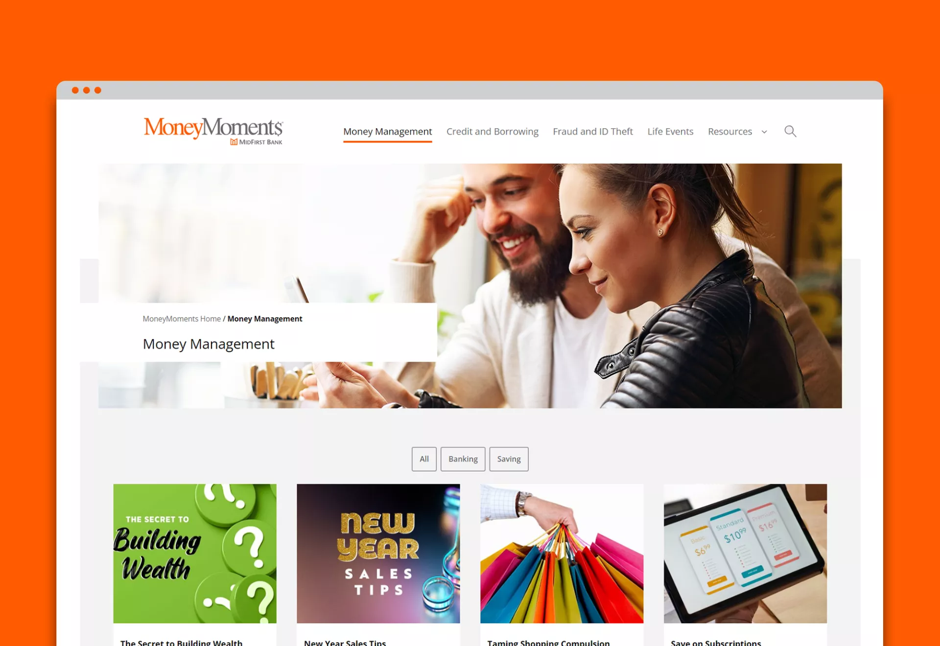
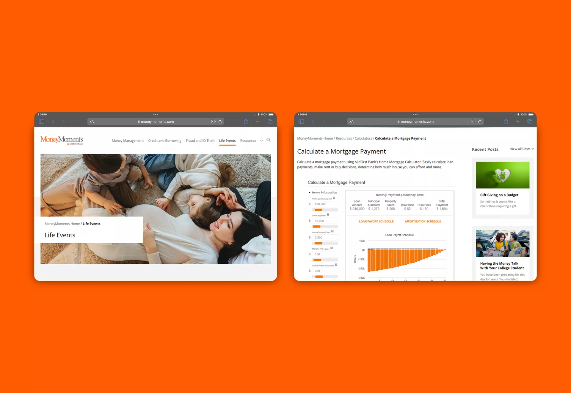
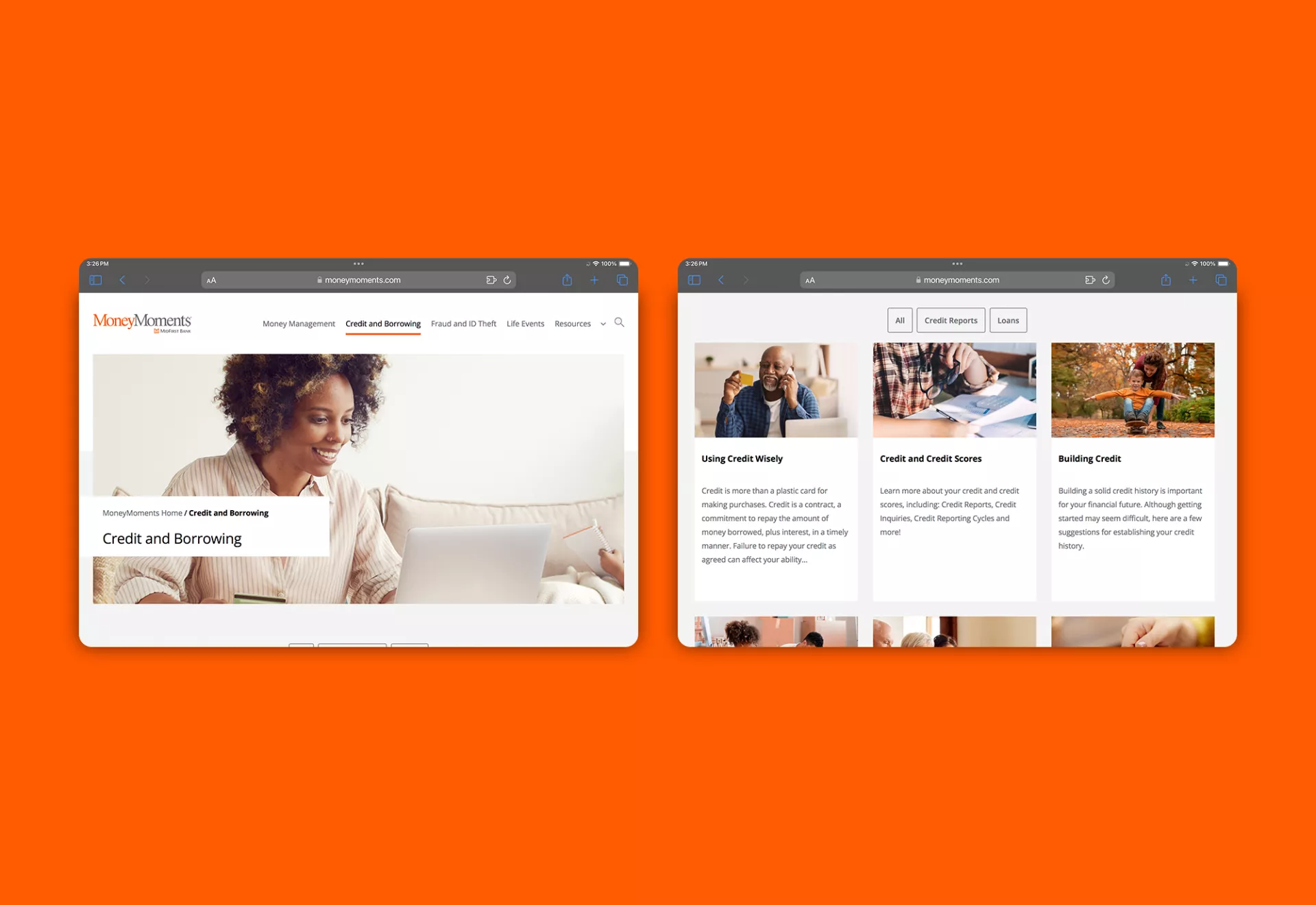
The volume of work for this project was a challenge – at Matcha Design, we intentionally have a small, close-knit team, and it would take time to build out each element of this project. The project required over 120 web pages, including multiple calculator pages and dozens of blog articles. Each of the web pages would fall under one of five main areas of focus: Money Management, Credit and Borrowing, Fraud and Identification Theft, Life Events, and Resources.
Another goal was to create a seamless experience for those who visit the bank’s website, then click over to the site for the financial education program. The branding would need to be similar enough to the bank’s that it would be clear that the financial education program was an extension of it. Even so, it would also need to be clear that it was not the bank, but one of the programs they offer.
Organization was another hurdle. We would need to be able to keep track of massive amounts of information – keeping everything well-organized and monitoring the stages of development and approval for each page.
Every page that we reviewed needed to be verified, since there were so many internal links in the original pages, and there had been many structural changes since the first set of content for MoneyMoments had been added to the MidFirst Bank website. Many pages had interactive modules that would need to be optimized, and workshop pages would need to link to different PPT presentations.
Along with that, we would need to test pages in order to create a secure, user-friendly site with fast loading speeds.
ADA compliance was another important requirement to be mindful of during the design process, requiring multiple levels of approval from the team at MidFirst Bank. Thankfully, our team was up to the challenge, having gained decades of hard-earned experience.
Solution
We planned the website design, mocking up the look and feel of the new website based on the reference materials provided by Midfirst Bank. In online meetings, we worked with the MidFirst Bank team, enabling them to review and approve our work as we went. Once we had approval for the initial stages, we began production (coding and populating the site, creating supportive visual elements, etc.).
Once production was complete, we reviewed and proofed our work, sending it along to them again for approval. Once that was complete, we optimized and tested the site before finally launching it, continually monitoring it through Google Analytics Tracking, Google GA, and Search Console.
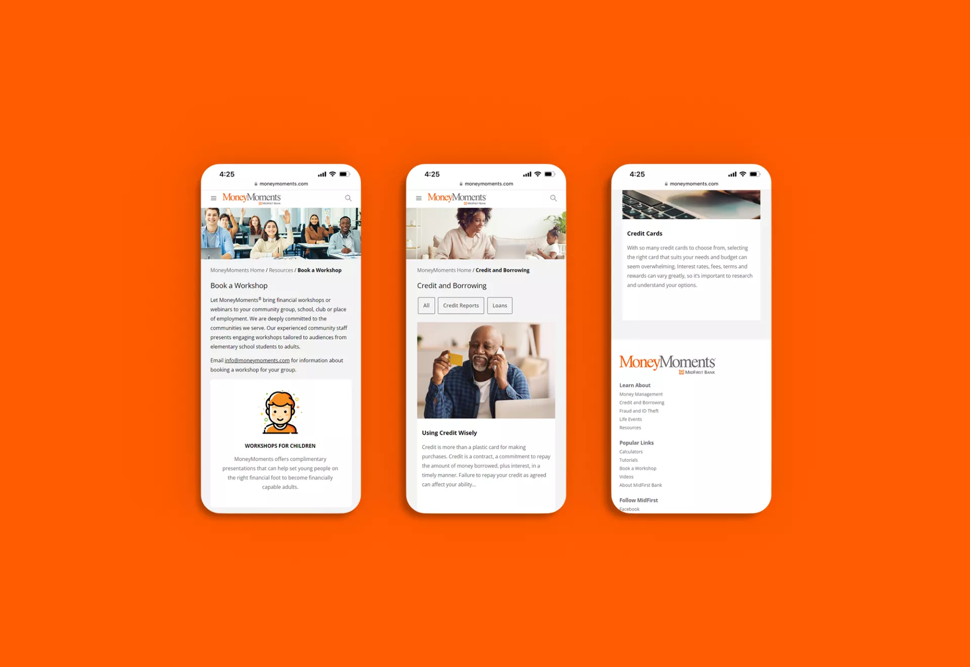
In order to keep everything organized, we used Excel Sheets to keep track of our lists during development. We ensured that the site was as responsive as possible, and we created new design elements in order to ensure consistency and coherence throughout the website.
We worked closely with our primary contact and the team at the bank to bring the financial education site to life. Over multiple video calls, we were able to define expectations for the project and keep all of our tasks organized. It took a variety of plugin tools, updates, access to their style guide, and multiple levels of approvals (including approvals from their web security team). All the hard work paid off, as the bank’s team was very impressed with how smoothly the project went.
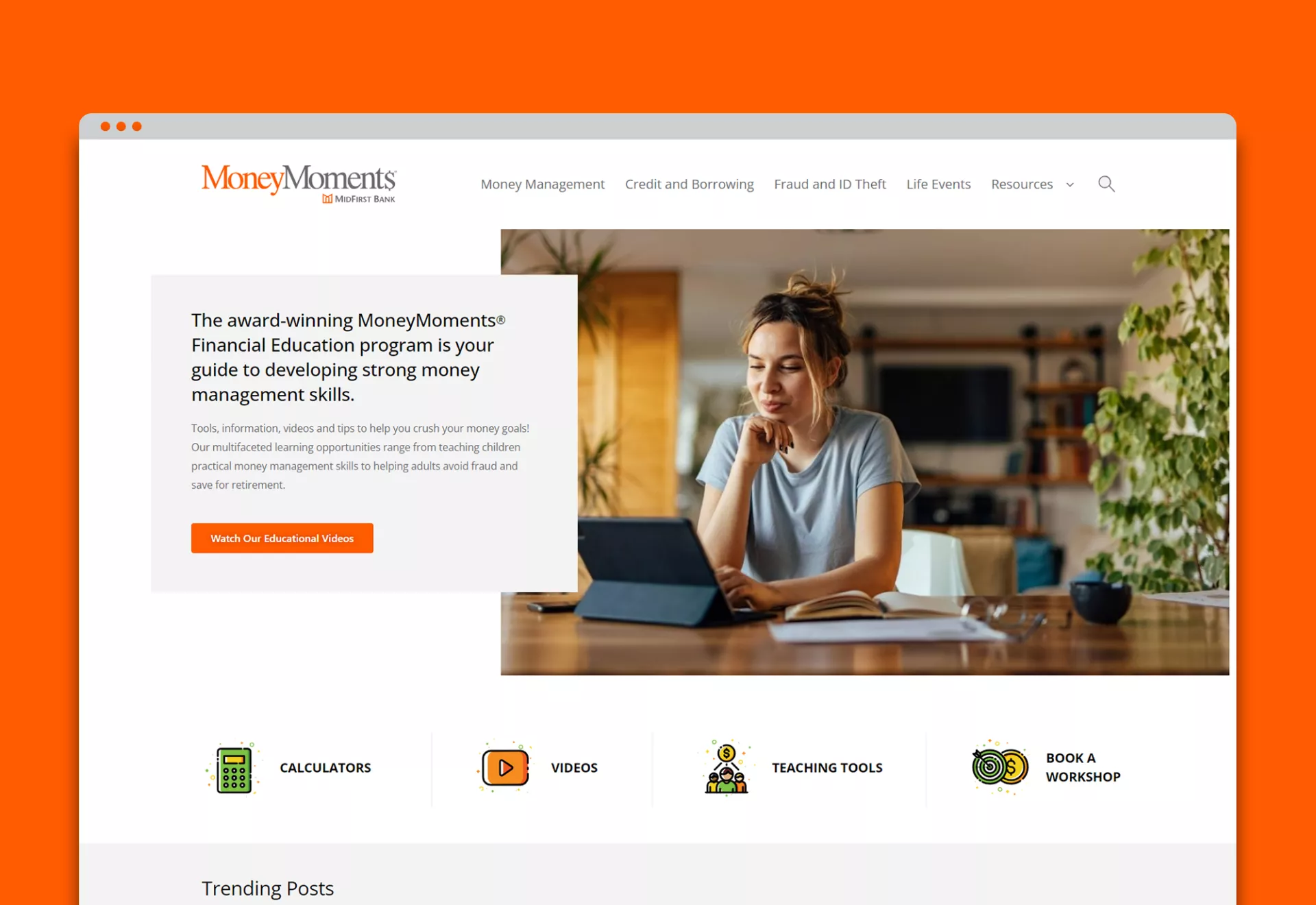
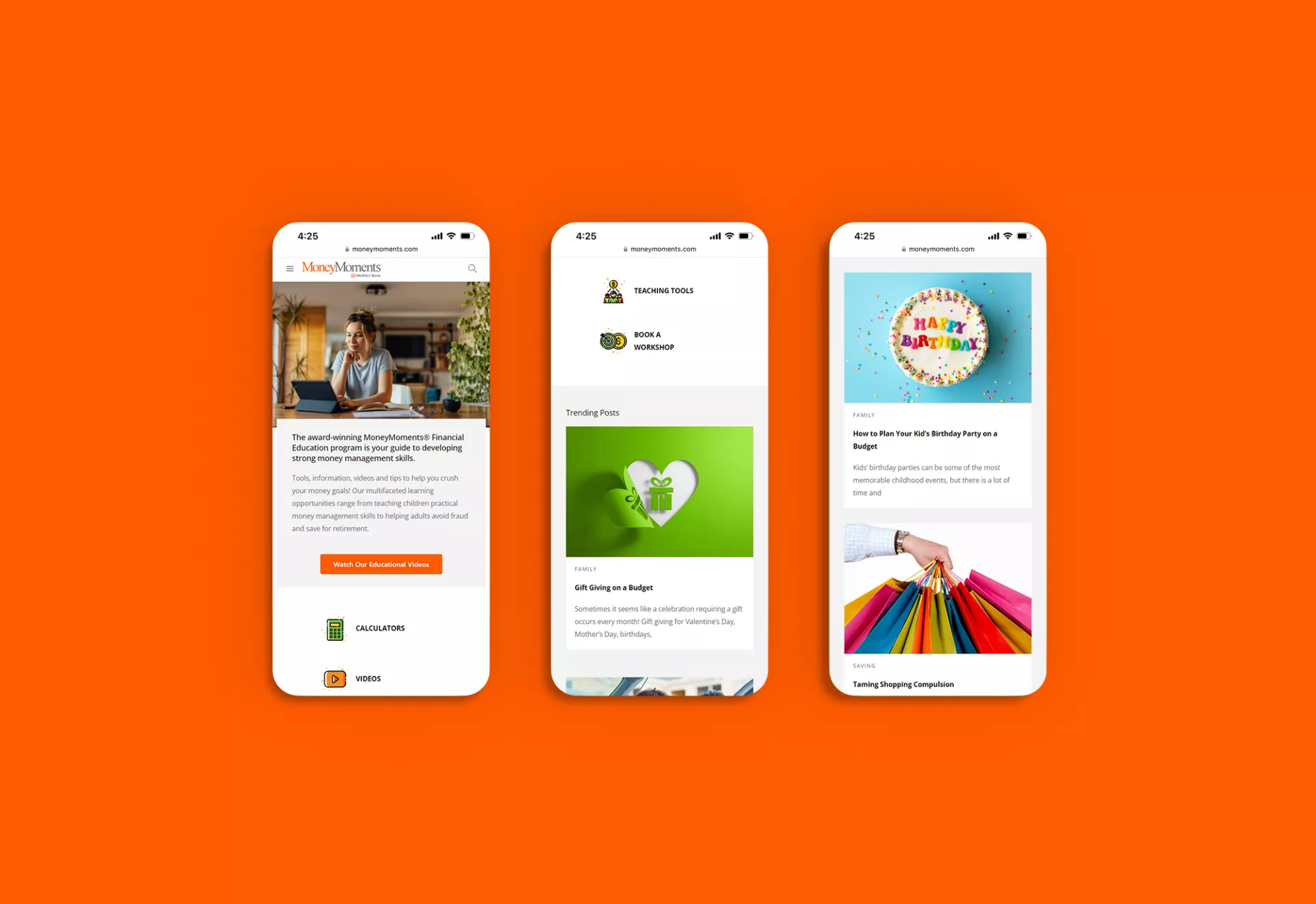
The website layout we’ve designed has fast loading speeds and features a clean layout utilizing their brand colors (orange and gray), with helpful resources and educational blogs toward the bottom of the home page. The five core categories are easy to access (at the top of the home page), and colorful (thoughtful) icons in the middle of the page enable you to easily navigate to calculators, teaching tools, videos, and tutorials.

