Jackie E. Smith Foundation Logo Design
“I appreciate everything you have done and the time it took. Thank you very much.” – Clay Smith / Tulsa, Oklahoma

Christian Scholarship Foundation in homage to beloved mother seeks custom logo design
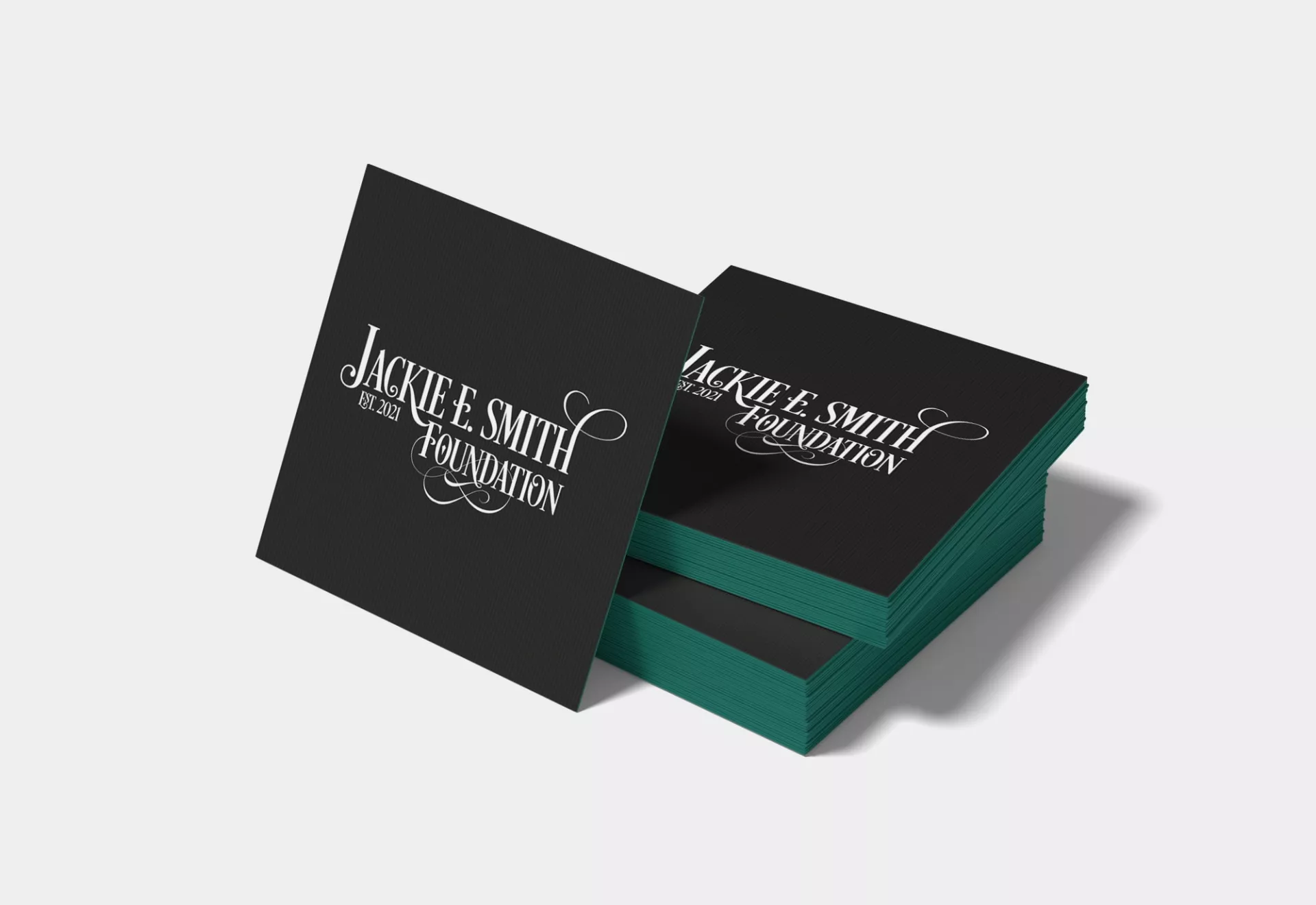
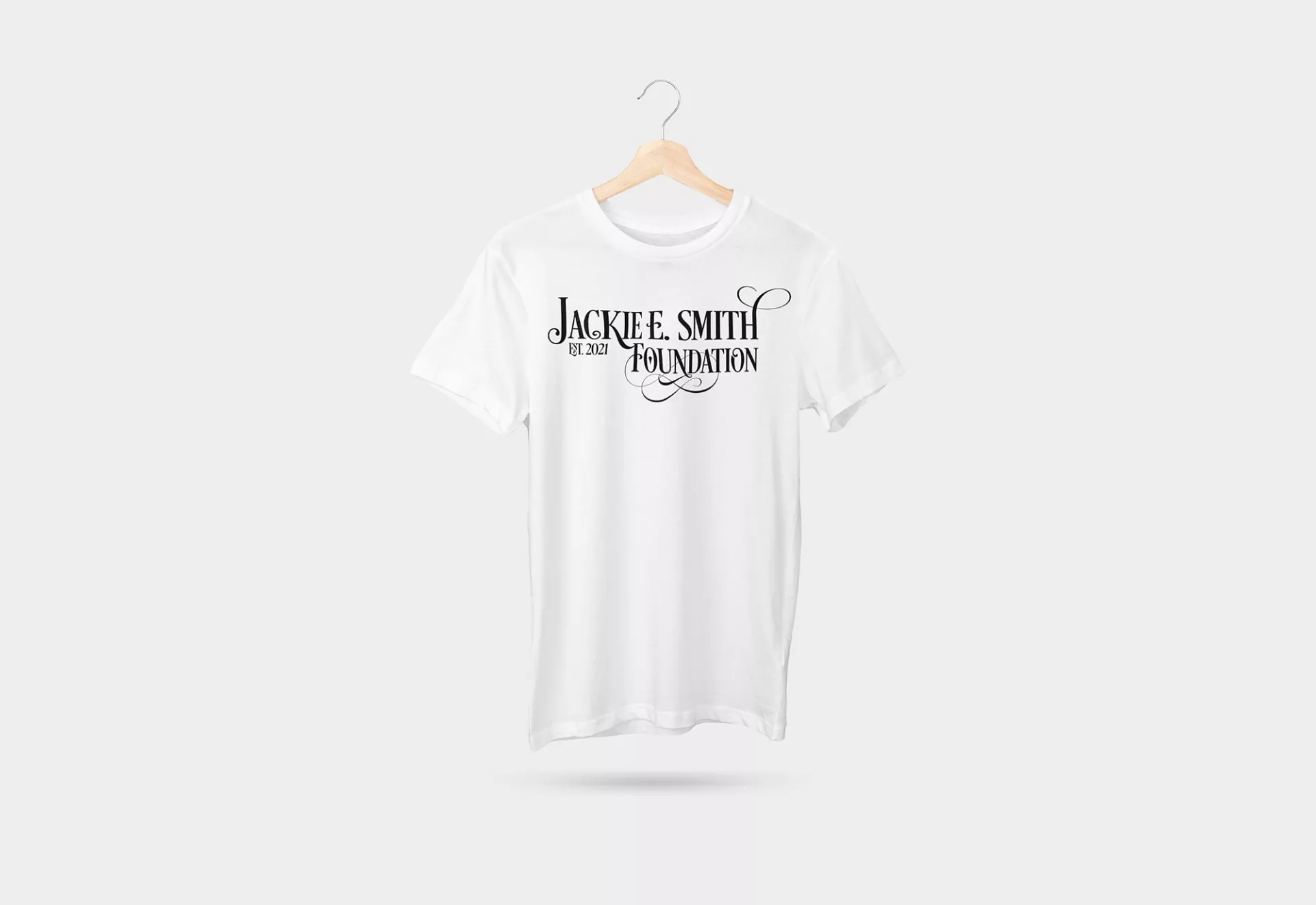
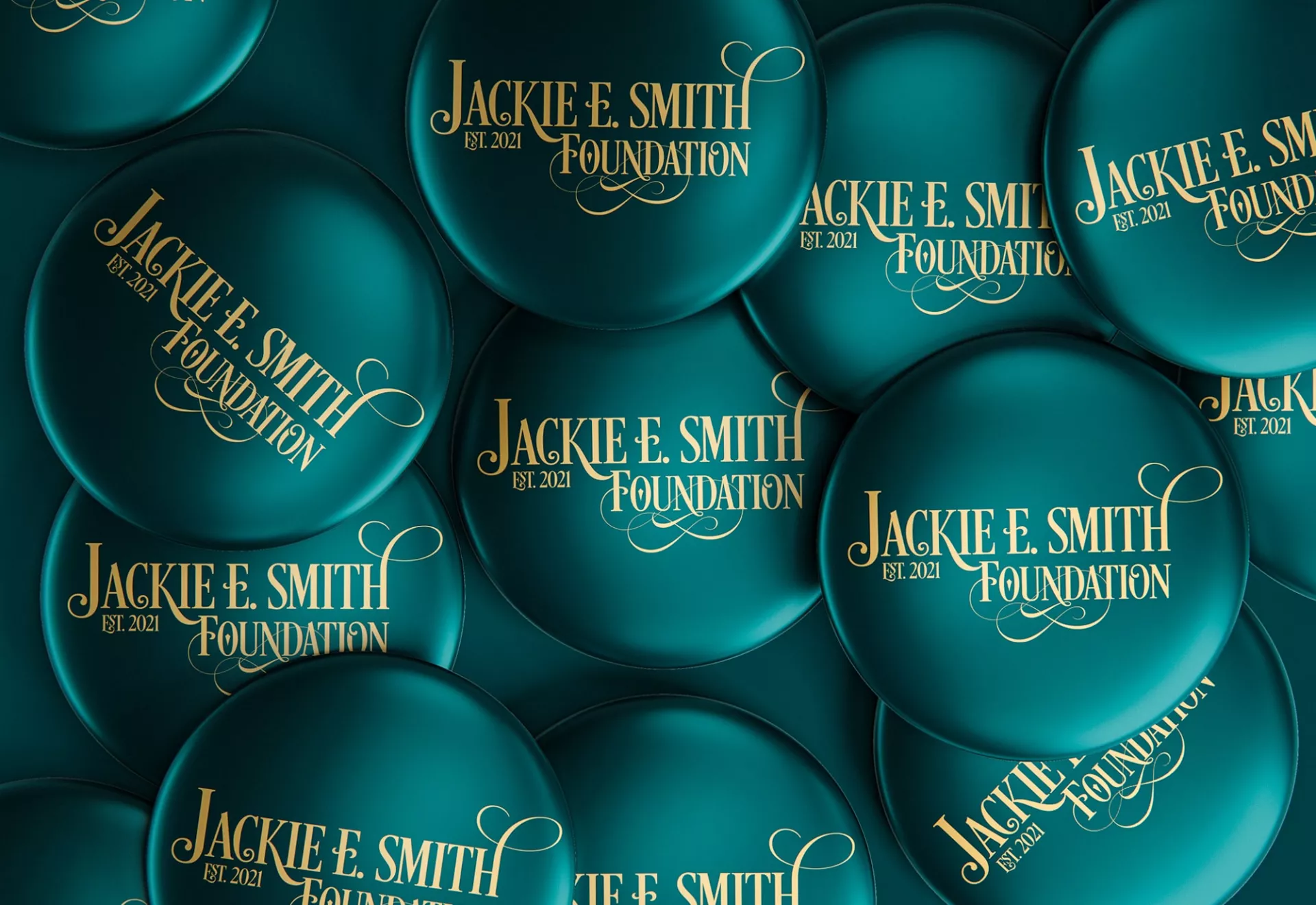
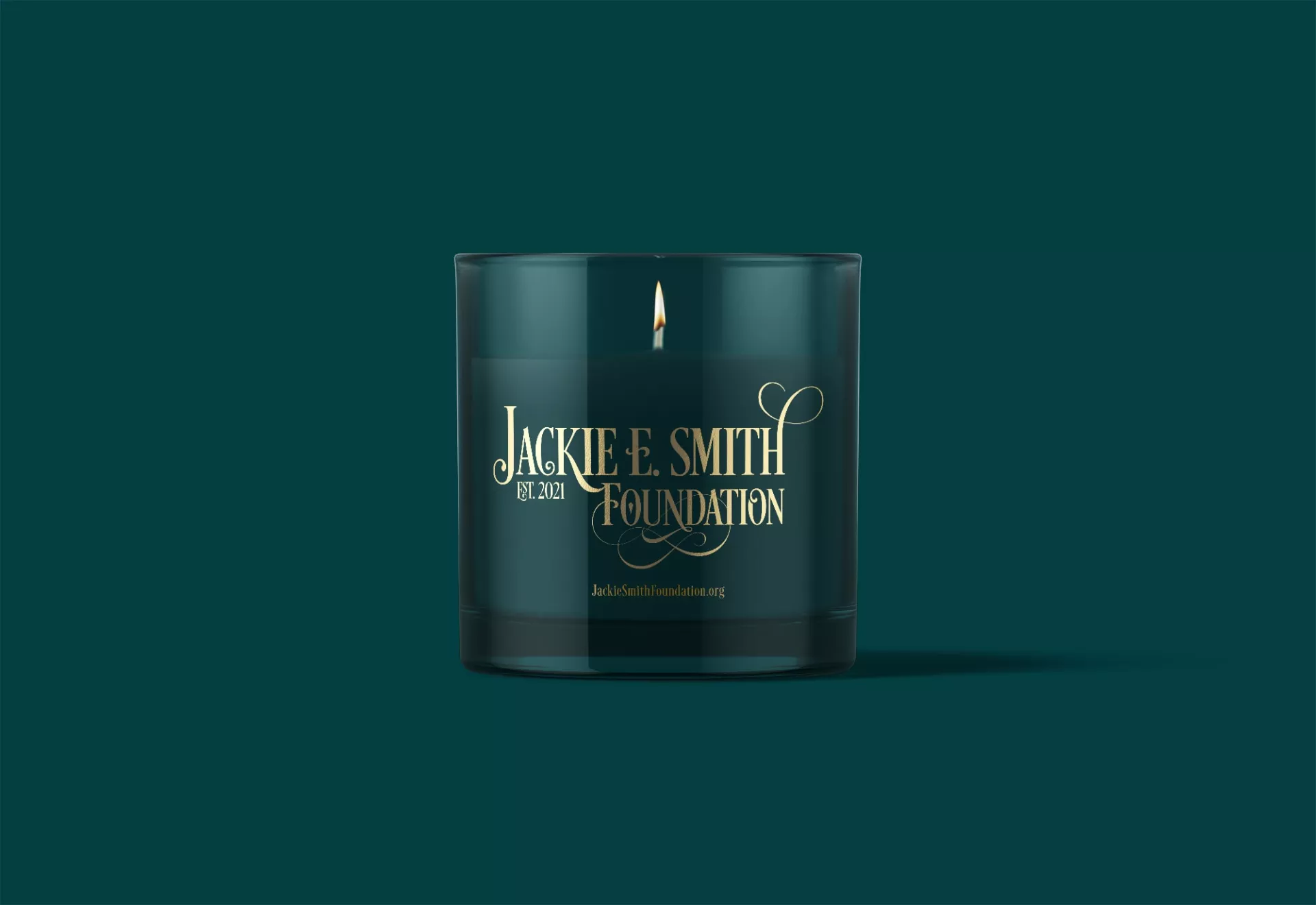
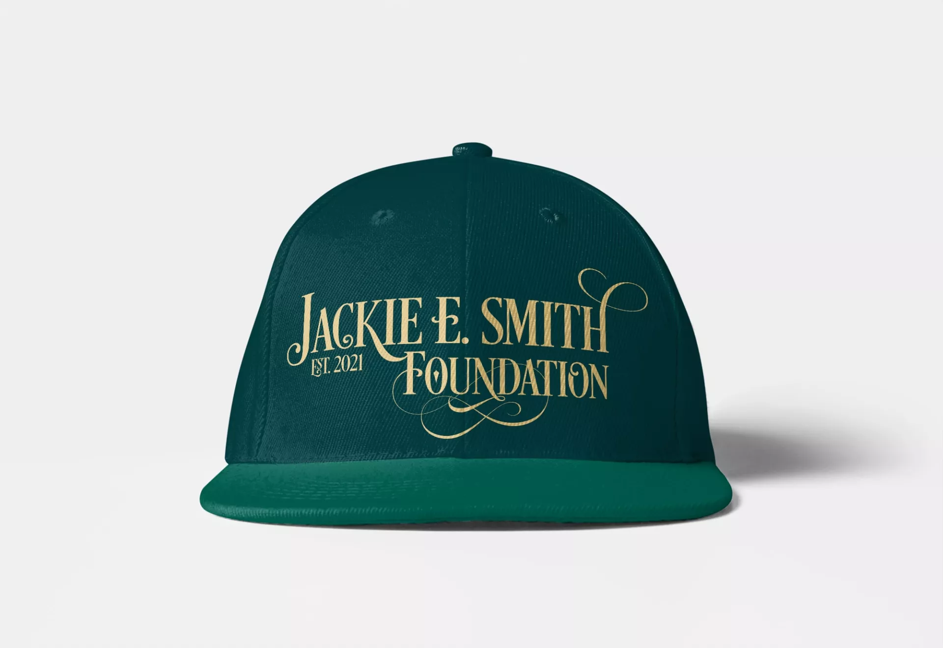
Our creative team designed an attractive logo design that was every bit as elegant and attractive as Jackie was, both physically and spiritually. Delicate, swooping curls accented the rich, gold color of the dignified font, representing the identity of the foundation and the legacy of Jackie E. Smith.
“The versatility of the design was clearly represented through the marriage of a strong, noble font with whimsical, artistic accents.”
Challenge
Following her passing, her surviving family members sought a way to honor her memory in a way that truly represented her energetic and charitable spirit. After some discussion, it was decided that a scholarship program would best pay homage to her legacy. They reached out to our team to create the custom logo design that would serve as the face of the foundation. An effective branding strategy was paramount to ensure the foundation reached as many underprivileged students as possible.
Solution
The text of the design, “Jackie E. Smith Foundation, EST. 2021” was written in a bright, vibrant gold in order to reflect on Jackie’s richness of life and of faith. We used a slender, serif decorative font known as ‘Desire Pro’ for the text and formatted it in all capital letters to convey the bold mission statement of the foundation. Due to the length of the text in the design, we stacked the text asymmetrically and balanced the left side with the date of establishment.
Letters with a natural curvature, such as L, C, and H, were accented with swirls and curls that carried the eye around the design, aiding in readability and conveying the vibrancy and effervescence of Jackie’s impact on her friends, family and community.


