Revolution Student Ministries
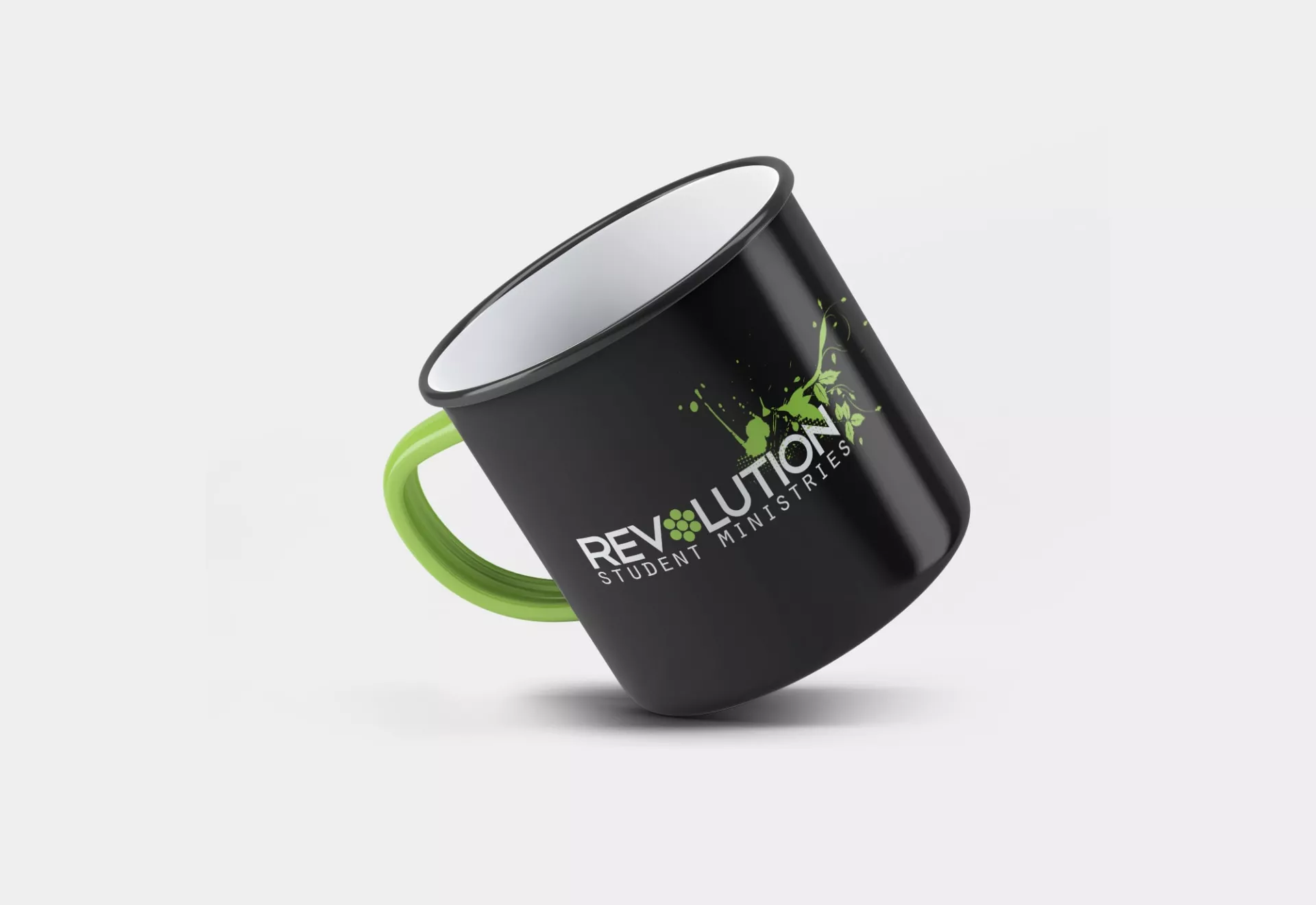
Student Ministry Logo Design that was featured in the book Logolicious
“Our creative team wanted to represent the youth, energy, and spirit of the members of the student ministries while also incorporating the theme of the church logo within the design.”

Tulsa church seeks custom logo design for energetic student ministries
Southern Hills Baptist Church is located in Tulsa, Oklahoma. They have been in operation for over a hundred years, providing service and prayer to generations of families. They host a number of different groups and ministries for the children and youth of the church, including student ministries. In 2008, this group decided to update and rebrand their logo in order to attract new members and represent the youth and energy of the students within the ministry.
Our creative team incorporated thematic elements from both the church and the group within the image of the logo design. We used healthy green leaves to represent the church, while contrasting circles and a bible established the name and nature of the ministry. The completed design was featured in the book Logolicious, which was written by Peleg Top, as one of the selected “Best Logos From Around the Globe.”
“The artful incorporation of thematic elements from the church and the name of the ministry effortlessly establish and support the mission of the student ministry.”


Challenge
The student ministries of Southern Hills Baptist Church, known as ‘Revolution’, wanted to redesign their existing logo. As they had received quality logo designs from our team in the past, they reached out to request a new logo for their student ministries. They wanted to incorporate themes of youth and energy while also creating cohesion with colors and design elements from the existing logo of the church as a whole.
Solution
The main colors of the design were black and green to continue the cohesion between the various logos of the church. These colors were present throughout the logo designs in one form or another to unite the groups and ministries under the same church.
We formatted the text of the design in two different edgy, sans serif fonts in solid black to create contrast. ‘Revolution’ was formatted in a thick, blunt font and in all capital letters as the namesake of the student ministries. The ‘O’ of ‘Revolution’ was replaced with a green flower-like design made of seven dots, with six green dots arranged evenly around a central dot of the same size and color. This circular, geometric styled design breaks up the text and adds a youthful flair. The number seven is considered a holy, symbolic number in Christianity, mentioned more than 700 times within the Bible and 54 times within the Book of Revelations alone. Underneath this text was ‘Student Ministries’, also in all capital letters. We formatted this text in a thin, serif font reminiscent of a typewriter-style font to contrast the rest of the text and emphasize the text.
The imagery of the design was an incorporation of the life-giving tree that is the centerpiece of the church’s main logo. We used the same green as the image within the text to unify the design and further represent the tree. We melded themes of leaves and vines, small dots, and a more abstract, splatter-paint design to represent the youth and energy of the group’s members. The design is situated on the right side of the design, above the ‘tion’ of ‘Revolution’, accenting the text and drawing the eye across the design. The portion of the design that overlaps the text is made up of a net of small dots, incorporating the dots from the text and preventing obstruction of visibility within the design. The upper left portion of the image was an abstract, splashed-on design, which blended seamlessly into the more defined leaves and vines of the upper right portion of the design.


